

Helping users save time and reduce stress by making stove monitoring easy for users anywhere and anytime.

Case Study | 4 min read
The design process focused on simplifying the interface as testing revealed that certain features and components were unnecessary. I streamlined navigation by rethinking how the product was presented to users, eliminating sub-pages, merging features, and restructuring others throughout the iteration process.
For more context and research behind the designs, check out the project overview page.
Design Goals
How can we effectively alert users in case of danger at home?
There are 2 high level objectives that the app needs to accomplish:
HMW Effectively Alert Users?
Using visual indicators to signify a dangerous event in the kitchen, and using push notifications to alert users in and out of the home.
HMW Help Users Reduce Stress?
Features like live view and individual burner monitors give users a peace of mind even if they are not physically standing by the stove.
In-app design
Making complex thermal data intuitive for users to monitor their stoves
Home dashboard - default
Once the users complete their personalization and onboarding process, they are led to the dashboard, which houses basic monitoring features and timers.
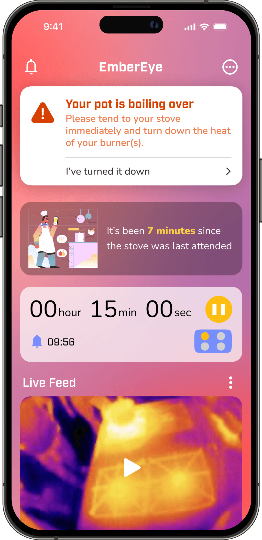
Home dashboard - alert state
The background changes when the system goes into alert state to warn the users of potential kitchen dangers.

Push notifications
Users get push notifications in or out of the home so they can stay alert no matter where they are.
Overcoming technical constraints and skepticism about scope creep
The transition from hardware prototype to a connected safety solution required overcoming technical constraints and skepticism about scope creep.
I broke through by:
Conducted discovery research proving that real-time alerts were essential for user safety
Recruiting an iOS developer to implement the vision (shout out to Jackson Cooley <3)
By creating detailed mockups of device-to-app workflows and recruiting an iOS developer, I ensured the successful implementation of live hazard notifications—a feature that redefined engineering priorities. The result wasn't just another sensor—it became the only project out of all capstone projects delivering live hazard notifications to users' phones. This pivot from hardware prototype to connected safety solution won faculty recognition and proved user experience could redefine engineering priorities.
Prioritizing
Figuring out what types of events require actual blaring alerts
To understand what sensors and calculations were needed, the electrical engineers and I collaborated to identify all hypothetical events that users would encounter in the kitchen and around the home.
During an exploratory testing session, I had interviewees complete a worksheet to determine which events warranted a physical alarm (such as beeps or flashing lights) and which required only a push notification. They also ranked the urgency of these events. Although not all use cases were implemented in the end due to technical constraints, the results still helped us configure the alarm system and prioritize the detection of critical events.

Worksheets the users filled out
Alerting Users
Removing the unnecessary and keeping the gold
In the proof of concept sketch, I imagined a lot of features that users might need based on our engineering project brief. But user testing would later prove me wrong. The concept was a good starting point, but I would eventually learn that simplification was actually the key to making sure the interface remained intuitive and easy to use.
Throughout the iterations, I also gradually implemented iOS design patterns to make the app look more like a native iOS app, which also helped the developer code the app.

The design evolution of the dashboard design from V1 to final
Using different states to communicate stove status and alert dangers
With the use of visual indicators like changing the state of the alert card and using a red hue as a background, users can be effectively communicated of impending danger at the kitchen. This state is only triggered when the pot is boiling over, there is an active fire, or an event of a similar danger.

Dashboard alert state
The alert state card is emphasized using a white background to grab user attention
The top status card is usually on a dark transparent background, but the alert state is on a solid white background. This change in visual indicator can grab users' attention to take action and reduce the danger in their kitchen.
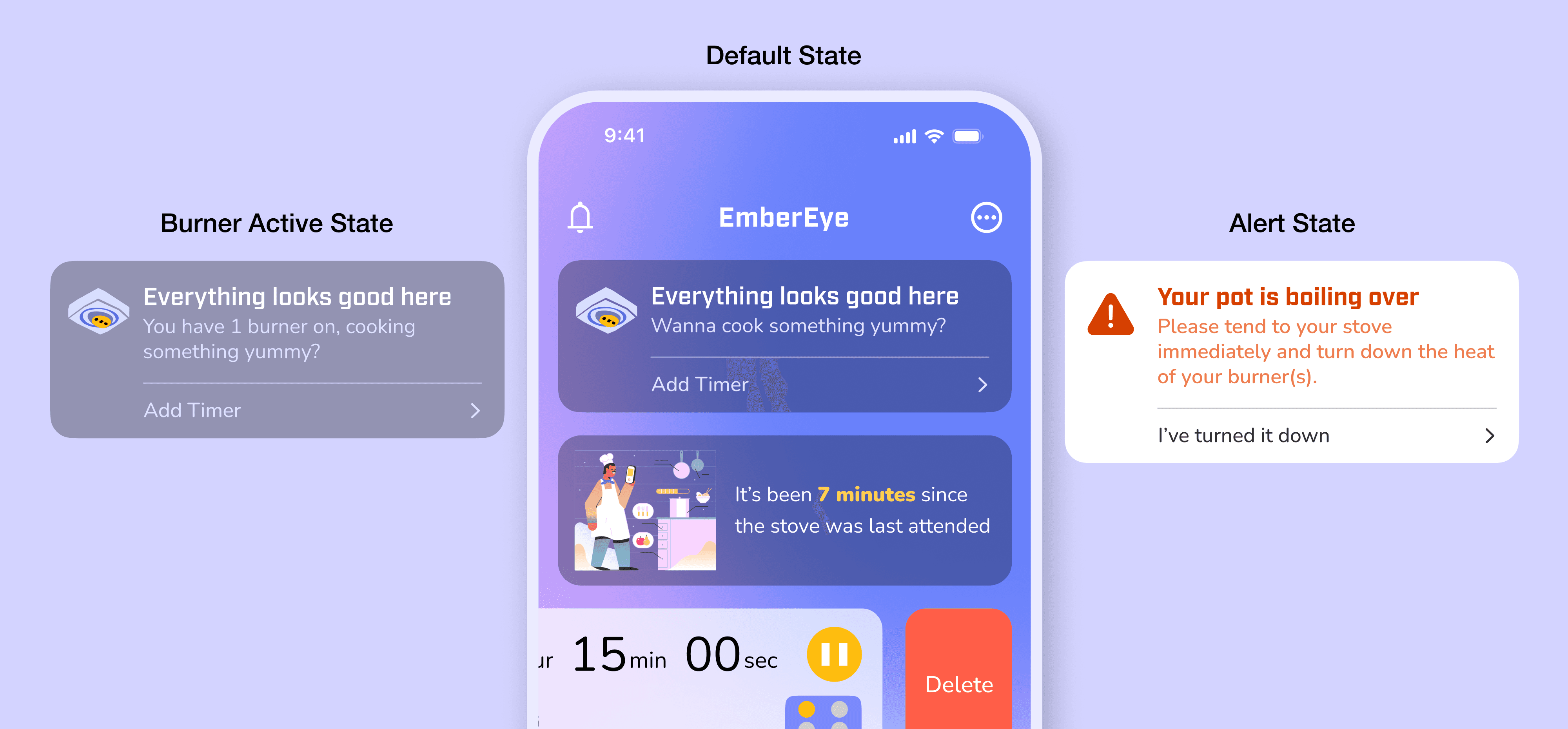
Different states of the alert card.
Individual burner status monitor allows users to keep track of burner usage in multi-burner scenarios
During user testing, we observed that home cooks—especially when preparing multi-course meals—frequently lost track of which burners were active. This created unnecessary stress and safety risks, even if not directly hazardous.
By surfacing burner status clearly on the dashboard, we addressed a real pain point in users’ cooking workflows. While leveraging existing backend capabilities made implementation efficient, the decision was driven by observed behavior: users actively sought this visibility during testing to maintain control over their cooking environment. Placing it at the bottom prioritized critical alerts while still supporting situational awareness during complex tasks.

Different states of the alert card.
Push notifications allow users to stay up-to-date with any potential dangers even when they are not home
When something is occurring at the stove, users would receive a push notification that prompts them to take action and also bring them to the alert dashboard state.

Push notifications example
Features for a Peace of Mind
To prevent alarm fatigue, I designed a timer system that adapts to real cooking workflows.
The feature lets users set custom durations for dishes requiring unattended simmering or baking, suppressing unnecessary alerts until the timer completes. This balances safety with practicality—protecting users without treating them like negligent cooks.
By aligning notifications with actual cooking behaviors, I transformed nagging alerts into helpful kitchen partners.
Timers can be accessed from the dashboard but it also exists as a separate page
What’s a mobile app good for if you can’t even see your stove when you’re outside?
The live view is a key feature of the app, and it's the main reason my team encouraged me to explore designing it. The idea is simple: if you can see what's happening with your stove, you'll feel more assured. If an alert goes off, you can quickly check from your phone to see if it's a false alarm, reducing anxiety. And if you leave the house unsure whether the stove is on, you can verify it through the live view without needing to rush back home.

Watch your stove from anywhere at anytime!
Measuring Success
How can we make sure the design was impactful?
Although I’m proud to have contributed to a final working prototype with the engineering team, I did not have enough time at the end of the project to properly test and measure the success of the final onboarding design. If I had more resources and time, here’s what I would do to ensure impact and success:
⏲️
Observe users using the timer
A huge inspiration of the timer was iPhone's clock app. Although apple has renowned UX design practices, some patterns left me confused. I would like to test the timer feature further to ensure all elements are actually necessary (labels, presets, etc) and placed optimally in the frame.
👁️
Testing & research for live view
Given the chance, I would test out the live view feature more with a user outside of the home so I can identify key functions in the storage and labeling aspects.
How long should a footage be recorded and how long should it be stored?
Could we use AI to help label the contents of the recordings?
How far back should users be able to rewind the live footage?
🧍
More real live testing
Although likely not optimal, it would be really insightful to see users react to a real dangerous event when seeing an alert on their phone. This would allow me to understand what actions they take first.
Do they check the live footage first?
Do they call someone at home?
What behaviors do they have and how can we support them in an event of possible danger.
Would the red background of the alert state further stress out the users?
Read more in-depth about my design processes
Reducing churn and ensuring intuitive experience during the onboarding process
