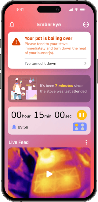
Minimizing churn and helping users set up EmberEye in the kitchen
Case Study | 5 min read
Sometimes instructions just aren’t enough to make sure people do the right thing. Text too long? Skipped. Confusing graphics? Skipped. What I thought would be a simple design process turned out to be more complex than anticipated. Setting up a physical device with an app is a complex activity, and guiding the users through the process in a straightforward manner is crucial. Through trial and error and testing, I simplified the onboarding to distill the most relevant and necessary steps.
For more context and research behind the designs, check out the project overview page.
Design Goals
How do we ensure the designs will help users while keeping feasibility in check with the rapid timeline?
There are 2 high level objectives that the app needs to accomplish:
HMW Minimize Churn
Use progressive disclosure, clear hierarchy, and concise instructions to prevent user burn out in the onboarding process
HMW Encourage Accurate User Input
Encourage users to double check their input by using check points before moving onto the next step and additional hints when needed.
Final Designs
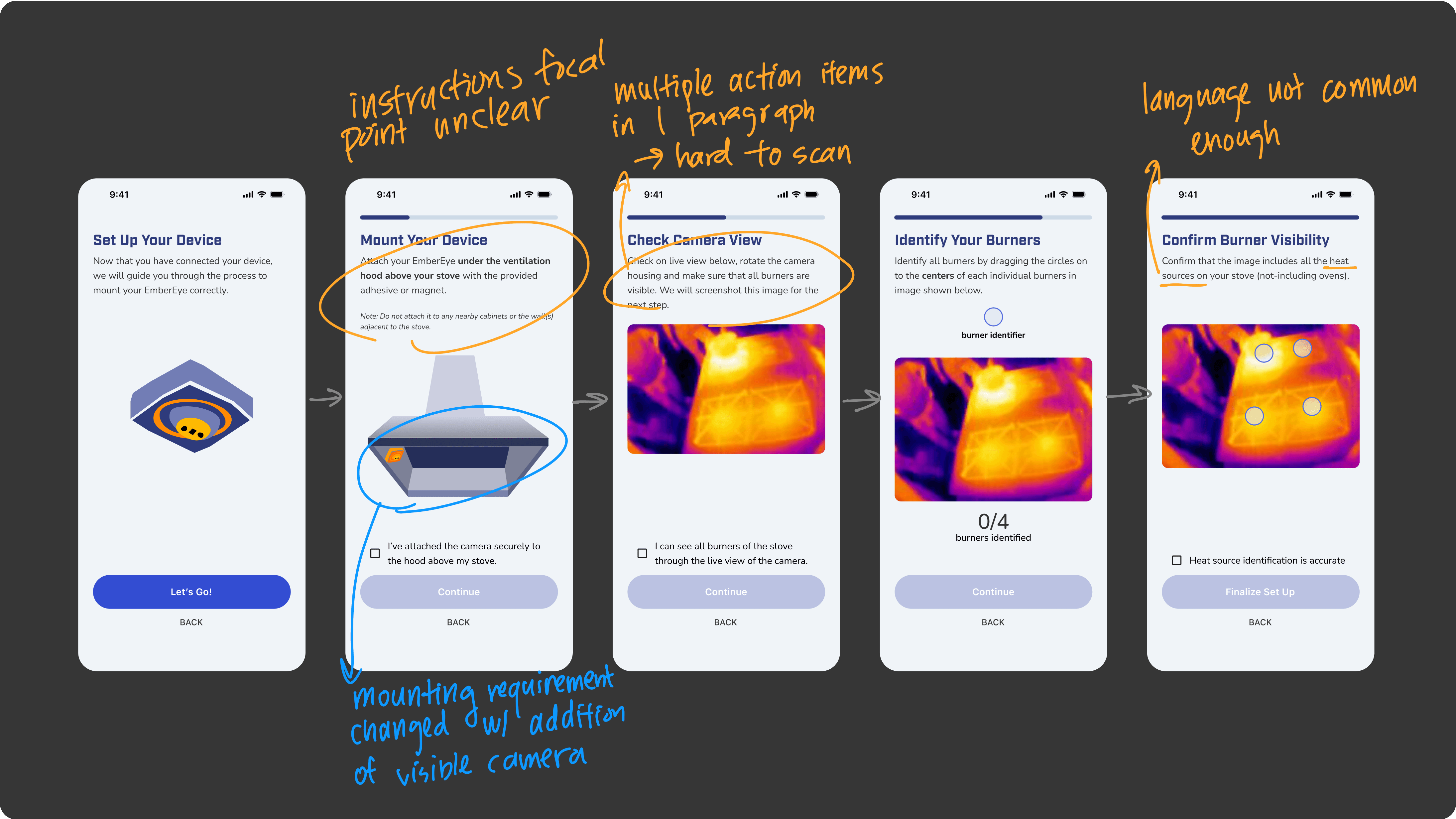
Onboarding
Ensuring an intuitive onboarding process using progressive disclosure
Device Set Up & Connection
Users first connect the app to their home or local network, then connect to the device before mounting.
Device Mounting & Finalize Setup
The mounting process involves users physically setting up the device in their kitchen, handling both the devices and the phone with the app. Clarity and simplicity is crucial here.
Vision Alignment
Getting buy-in from the team and faculty was not an easy feat…no one had app-dev experience, so what now?
To ensure a smooth onboarding experience, I advocated for app integration despite initial skepticism from my multidisciplinary team, who lacked iOS development expertise.
I broke through by:
Conducting rapid UX research proving remote alerts addressed critical user needs
Developing high-impact mockups demonstrating the device-to-app workflow
Recruiting an iOS developer to implement the vision (shout out to Jackson Cooley <3)
Initial Research
Learn how the others do it fist: onboarding study
As this was my first time designing a digital solution for a physical product, I wanted to get a better understanding on how the other products designed the app connection mechanics and the user flows. I looked at other direct and indirect competitors in the physical-app product space and focused on the user input and configuration flows as those are some of the main challenges in the design process.

Audit of other competitors
One of the main things I noticed was that the instructions always had a visual element to indicate users how to configure or set up their physical product. This was either done with videos or animated guides. I also noticed that they kept the textual instructions relatively short and split into smaller tasks to prevent churn and overwhelming users.
Connection & Pairing
Wi-Fi & Bluetooth connection methodButton presses or QR code scanning for pairing
⭐️ Visual indicators and feedback are crucial
Configuration
Questions during onboarding to understand user’s home environment + pairing
⭐️ Progressive disclosure to prevent churn
Instructions
Keep it simple and relevant
Video/visual instructions or guided tutorials
Predict possible Q&A for troubleshooting
⭐️ Simple and concise instructions
Onboarding Iterations & Testing
A journey of simplification and interaction
Even with the design goals guiding my process, the testing sessions between iterations still informed me to further simplify my designs and make onboarding more straightforward. I conducted 3 testing sessions throughout 6 iterations of prototypes, speaking with users both on zoom and at their home kitchens.
Using deliberate friction during the physical set up to prevent errors while validating users’ actions
Checkboxes reduce the likelihood of users speeding through them and skipping ahead. They encourage users to check their work and prevent errors.

Checkboxes at each step of the set up process
At a high level glance, the V1 onboarding process was good, but user testing results identified some key pain points and allowed us to refine the experience
I conducted moderated user testing sessions both on zoom and in users’s kitchens to get a better idea of how the onboarding design performed.
Notes on V1 prototype
After testing with users, I discovered that although the detailed instructions in the onboarding flow provided reassurance for the users, it also posed an immense amount of mental effort and cognitive load to go through each step. The user testing after the first few iterations revealed pain points regarding visual hierarchy and information overload for users.
Information Overload
Instructions and recommendations were too detailed, users did not know which parts are the most crucial to focus on
Solution
⭐️ Changed information architecture of mounting instructions to reflect relevant info only
⭐ Display crucial instructions only, the rest go to hints to be used when needed
Lack of Visual Hierarchy
Difficult to tell which part of the screen users should focus on
Solution
⭐️ Used different backgrounds for instruction texts to highlight its position in the screen
Lack of Visual Guidance
Unsure where exactly to mount their stove with only textual instructions. Some steps were confusing
Solution
⭐️ Included visual hints on where to mount the device
⭐️ Added animated hint for burner configuration drag and drop for clarification
⭐️ Added visual feedback to confirm screenshot taken of burner with thermal camera
I restructured the onboarding user flow to address these pain points.
By providing targeted instructions based on the user’s home environment, I reduced the cognitive load and streamlined the experience.

Notes on V1 prototype
Displaying instructions for the entirety of the user base in one go can overwhelm both types of users.
After confirming my hypothesis with user testing, I devised instructions that cater to each type of users. The main differences being how the instructions are presented and which specific step or hints are emphasized to more efficiently guide the uses.

One of the onboarding steps, users choose whether their range hood is magnetic or not.
I also hid the secondary information and instructions in the hints to eliminate visual clutter. The information can be accessed by tapping on the hints during the set up process. We found from testing that these instructions and information did not hinder the onboarding process if they were not presented as primary instructions.
Hint cards accessible in the device setup process
“If we think something is personalized, we believe it'll be better suited to our needs” - Peter, BFM
The onboarding process is quite a lengthy process, all of the steps required for the backend system to craft a personalized experience for each kitchen.
Utilizing a dedicated screen to build up to a moment can help users believe that the experience in-app will be better suited for their needs, subsequently building more trust between the product and the users.
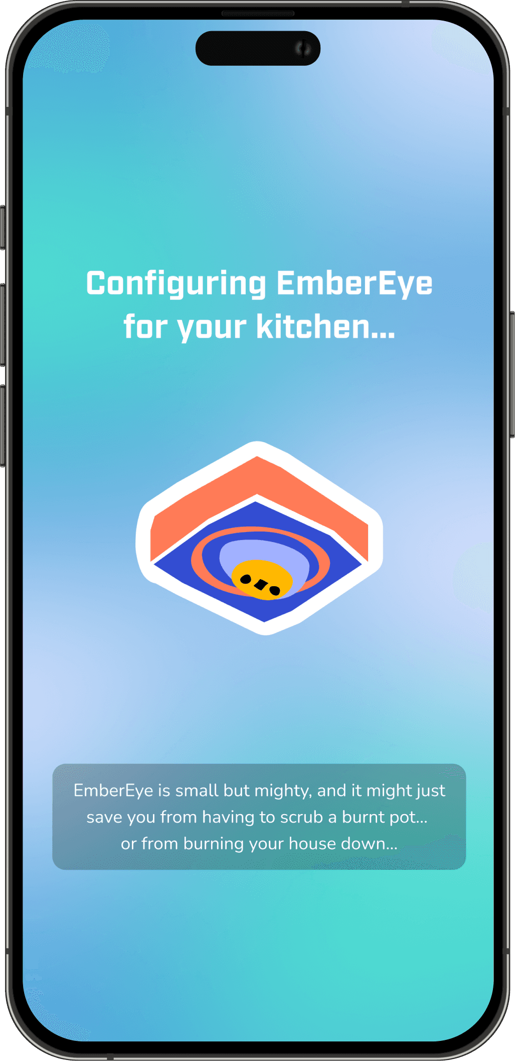
Last screen of the onboarding flow before moving on to the in-app experience
Final key changes that made the cut
Interactive and animated elements helped users reduce overwhelm and easier to follow the onboarding process
Animated tutorials
Animated tutorials with visual cues allows them to succeed without needing to read instructions too carefully.
Visual Feedback
Shutter animation indicates when a screenshot is taken. This visual feedback reduces cognitive load by clearly signaling that a step was completed, ensuring users understood the process without confusion.

Listing the burners
Listing all available burners upfront gives users clear visual feedback on how many they need to drag into the frame.
Measuring Success
How can we make sure the design was impactful?
Although I’m proud to have contributed to a final working prototype with the engineering team, I did not have enough time at the end of the project to properly test and measure the success of the final onboarding design. If I had more resources and time, here’s what I would do to ensure impact and success:
⏲️
Measure time on task
Measuring time on spent on each step of the set up process can help identify potential confusion in each step. I would do this either in person or with Useberry to gather larger quantity of data.
🧍
In-person testing
Observe users’ real life usage of the product as they set up the device in their kitchen to identify key pain points for further iterations.
👁️
Eye-tracking
Using tools like Useberry can help identify what sections or elements on the screen draw the users attention the most. This can inform design changes needed to help being out the most important elements up front to attention.